Branding
The following are select brands or campaigns which I've developed the branding and identity.
Verizon Accessibility lab
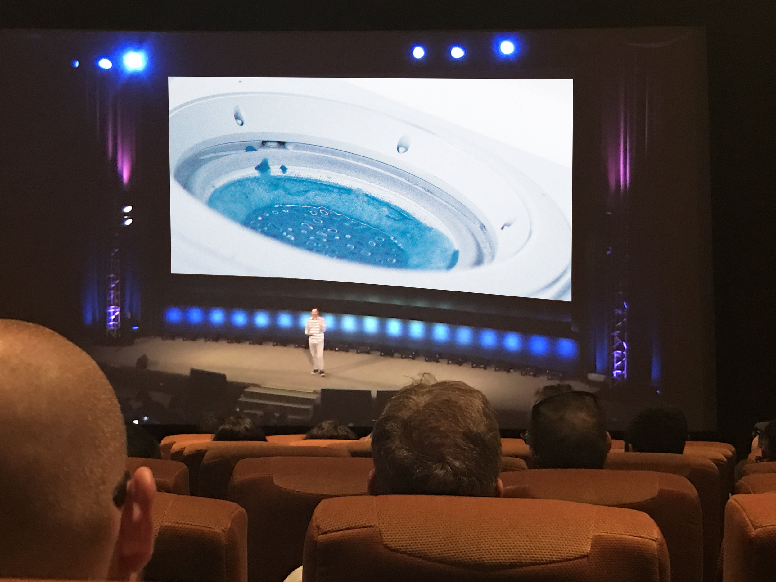
Creative Direction for The Accessibility Lab at Verizon. The Accessibility Lab is widely recognized as an industry leader in making Verizon’s product portfolio accessible to people with disabilities. These are explorations I created to represent accessibility in a conceptual way using cymatics, a subset of modal vibrational phenomena. Verizon wanted to speak about the Accessibility Lab internally and this is the branding I designed for the activation.
The images captured during this experimental video mirror the symmetry found throughout the natural world, like water moving in the ocean. They will serve as the visual language for the Accessibility lab’s identity in both print and digital format.
Color, scale, proportion, light, acoustics, aroma, and appetite can be used to influence behavior within an environment. The goal of this experiment was to create designs that engage more senses than just sight. I wanted to inspire humanity, regardless of the medium. When you build new experiences from the ground up, one sense at a time, you can reach beyond simple aesthetics and make a cognitive and emotional impact. What if you could taste words or associate numbers with colors? These are the questions I asked myself as I went about creating a way to see an unseen sense, sound. I researched cymatics, the study of visible effects of sound and vibration, and I discovered that cymatics reveals a strange and beautiful symmetry similar to nature.
Posters hanging in the Accessibility Lab in Sunnyvale, CA.
Accessibility Viewers Branding. I created a Verizon branded Google viewer for the Accessibility team to use as takeaway from the lab and or event(s). The idea is to promote the Accessibility team, The viewer will download the Eyeware app* and be able to see how eyesight can change with various diseases.
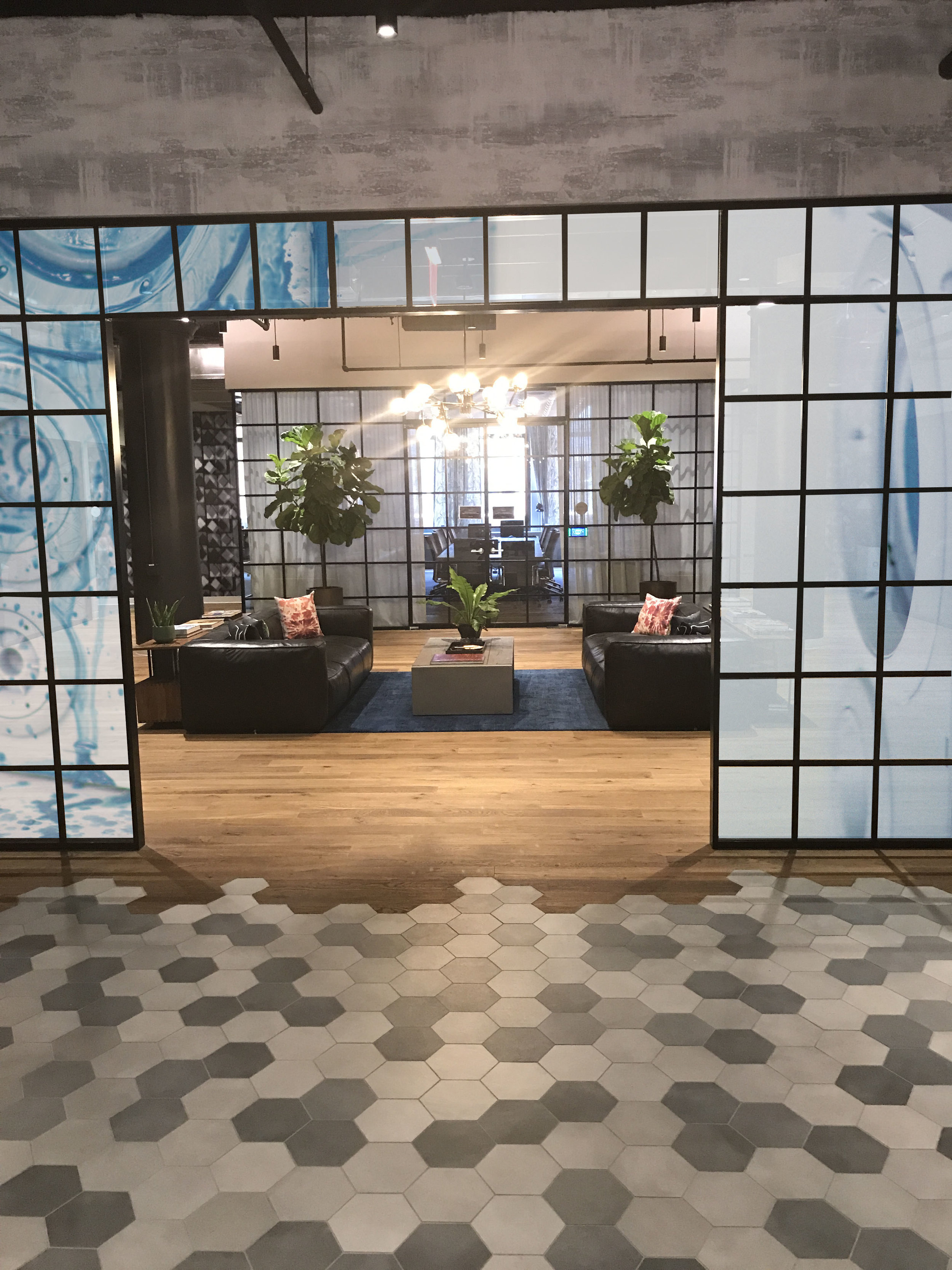
Photos of the Verizon NYC office with the Accessibility video and photography branding. I thought it would be interesting to break down the rich interior design with a bit of mystery from the visuals created. The imagery invites employees to question the meaning of why there is an activation in the NYC office.
Behind the scenes of the process: I took some old speakers and spray painted them white to reflect the 70% white rule in the Verizon brand guidelines. I shot it against a white background and white table. Then I poured a mixture of paint on it so that every time a sound played it created a corresponding visual element. I shot the stills using two video cameras and one photo camera. The videos were shot in slow motion and sped up in post production by 50% to show the movement of sound.
Verizon Navigators event
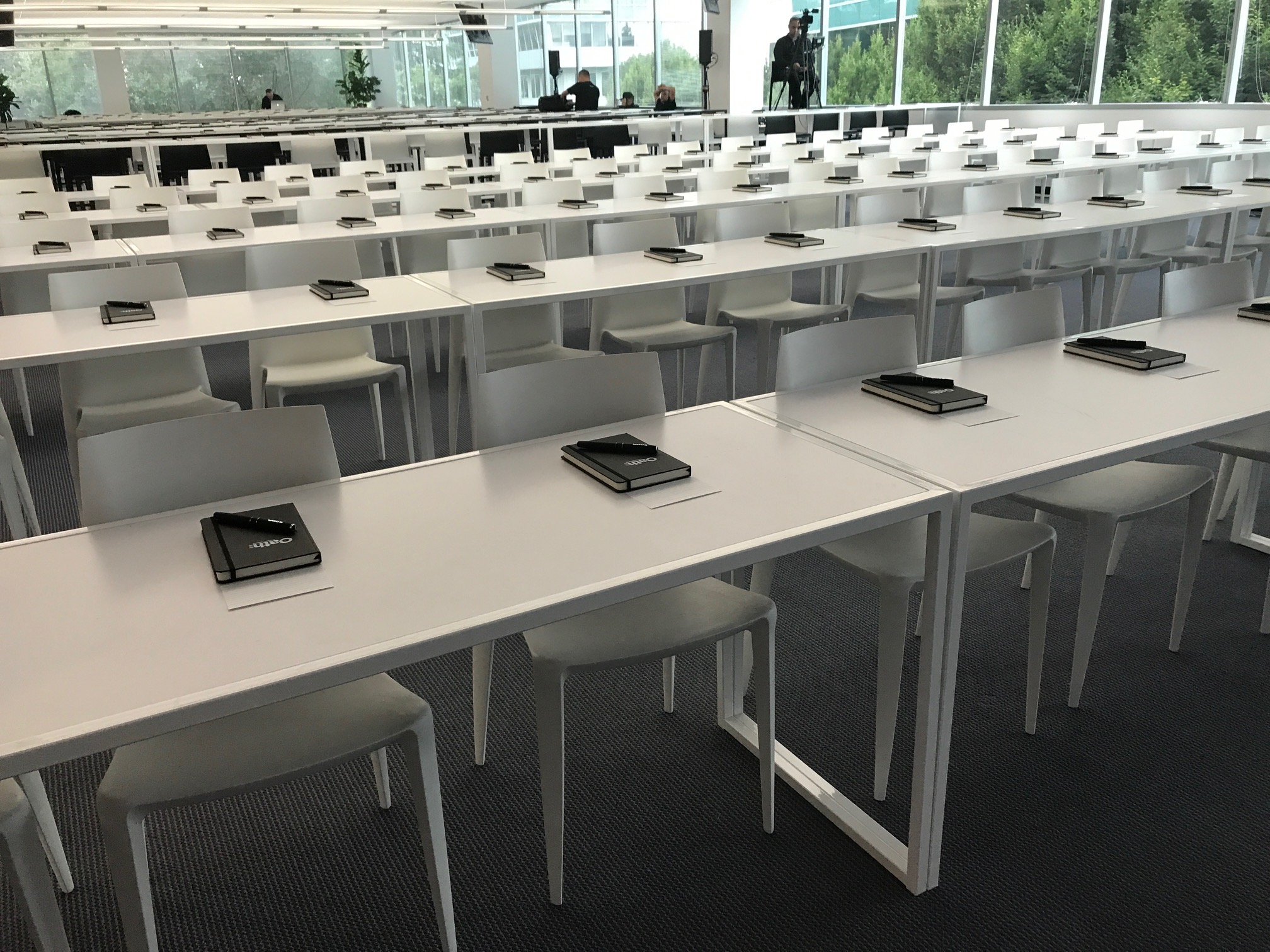
Hand-made logo I designed for Verizon’s internal event called Navigators. After Verizon bought Yahoo, there were a group of employees selected in the company to help navigate their departments after the acquisition. These leaders were then named Navigators. And below is the Creative Direction process in designing for their team/events.
The behind-the-scene process in making the logo and then photographing it in our in-house photo studio. We then used the photos for internal marketing collateral in print and digital formats.
The abstract imagery or extreme close up shots of the design help extend the visual language beyond just the usage of type. By having several different representations of the same string concept, I was able show how the design execution can be flexible in many forms and can live in various digital/print deliverables.
A life-size version of the logo was recreated for the event.
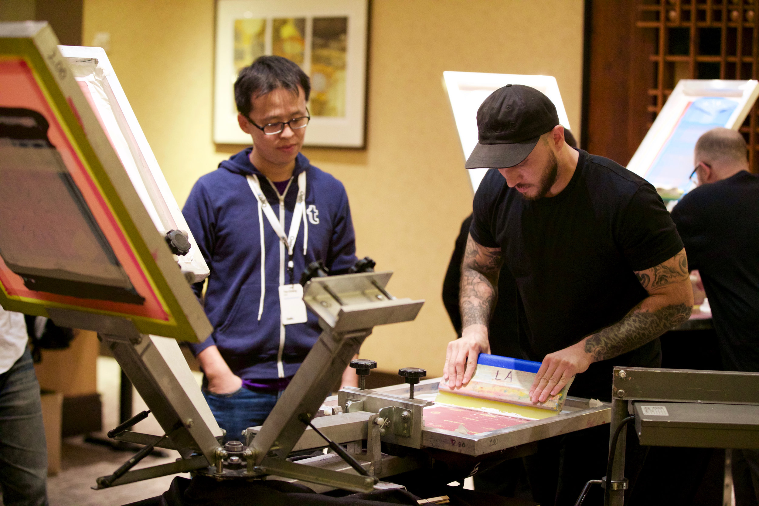
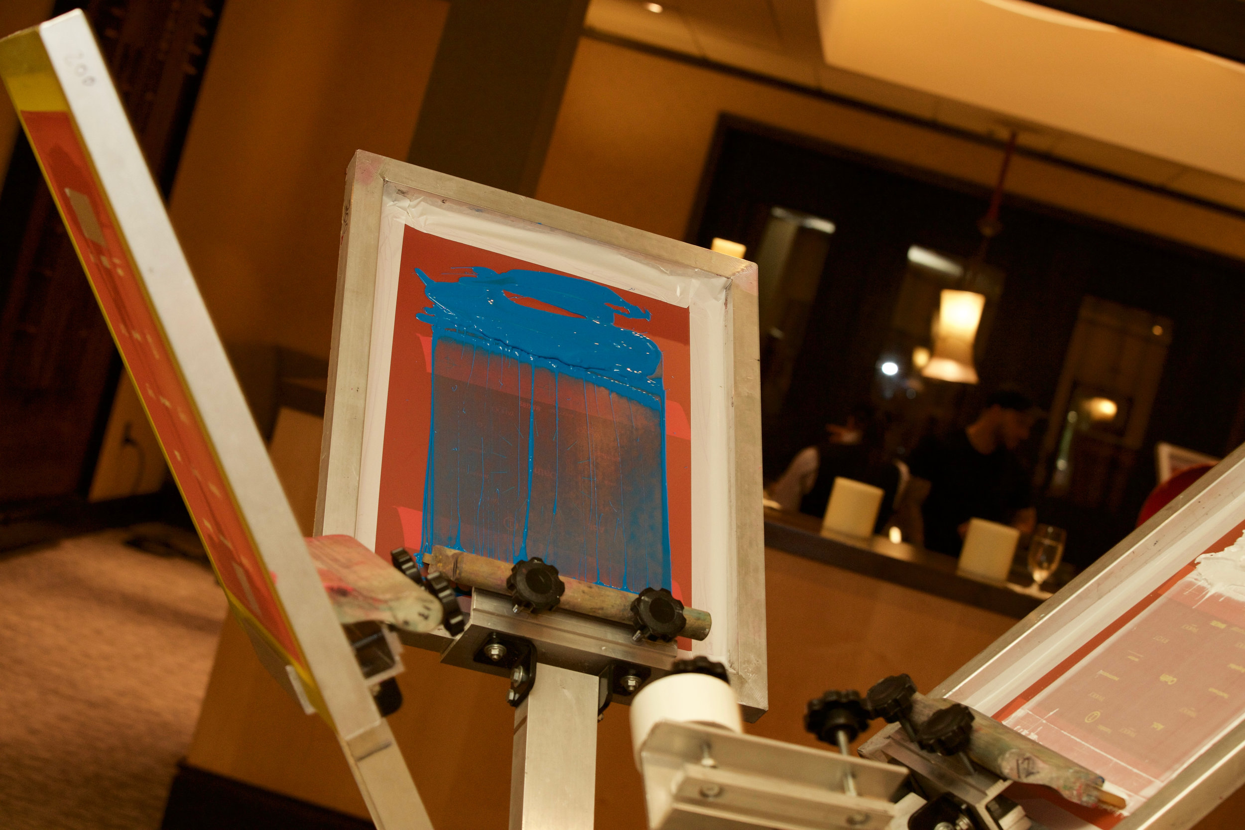
Attendees got a custom screen printed tote bag.


